Guest Blog - Karen Clark Designs
Karen Clark Designs explains how she created the brand identity for Louise Burchell - Yoga, Birth & Wellbeing
Working with Louise on her brand design was a pleasure - her passion for women's wellbeing during these fragile and exposing life events is infectious and I wanted to help her create a brand that she could be proud of and felt represented her.
For me the most important stage of the brand development process is the beginning - getting to know my clients and their ambitions for their business. Particularly with smaller businesses so much of the selling point is the person behind it, so learning personality traits that can be represented in the brand identity is very important, not only for customers to connect with it but for the business owners too. Often this is the first stage in bringing their ideas to life and they have to resonate with their brand, feel represented by it and proud of it.
Luckily Louise is very in tune with what she wants from her Yoga, Birth & Wellbeing business. She had clearly thought through her business plan, knew her audience and her values. In large part this was due to the driving force behind the business being Louise herself and her own experiences during pregnancy and childbirth.
During our conversations, it was clear that Louise wanted her brand to feel like a place of sanctuary for her clients. She wanted it to feel calming, reassuring and nurturing. She wanted to create a space for her clients to pay attention to their own bodies and feel connected.
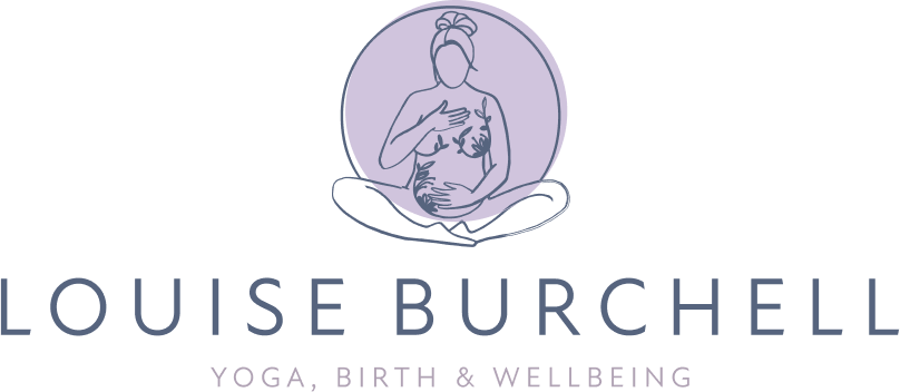
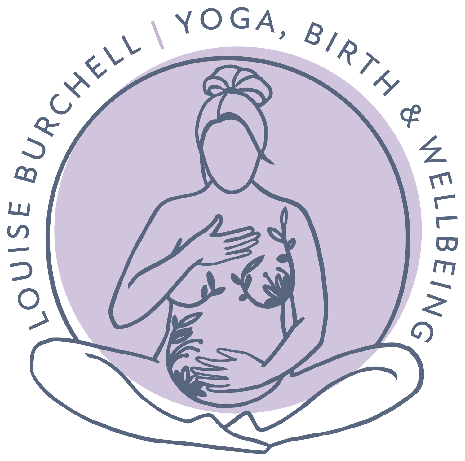
For me, the alignment with women and people’s bodies being a sanctuary for their growing babies was hard to ignore. Louise had also recently (at the time) posted a photo shoot she'd done during her own pregnancy and it made sense to put her front and centre of the brand identity. One photo in particular stood out, where Louise was sitting in a cross-legged yoga position, head tilted down with one hand on her baby bump and one had on her heart, and I felt it embodied everything she was trying to portray.
I used this image to create an icon for her logo, tracing the image in a simplistic style fitting for a brand identity - spending time tweaking the details and adding floral motifs to represent growth and nurture. We settled on a soft purple/lilac for the colour palette, with a soft dark grey blue to compliment it - very calming and soothing colours. The secondary palette includes teal which represents a bit of Louise's personality and preference. We then spent time expanding the brand and creating assets based on this initial logo for Louise to use to create her own materials.
Over all, I believe we succeeded in not only creating an identity that looks clear, professional and succinct, but a brand that feels representative of Louise and the sanctuary her classes provide for her clients.
Karen, it was a joy to work with you and I love my brand - thank you! Have a look at Karen’s website for more information about her graphic design and illustration services. As well as brand identity, she also creates beautiful stationery, prints, greetings cards and more.
Instagram - @karenclarkdesigns
Facebook - Karen Clark Designs
Find out about my classes by clicking the buttons below:


